Overview
Digital Identity
SVG Export
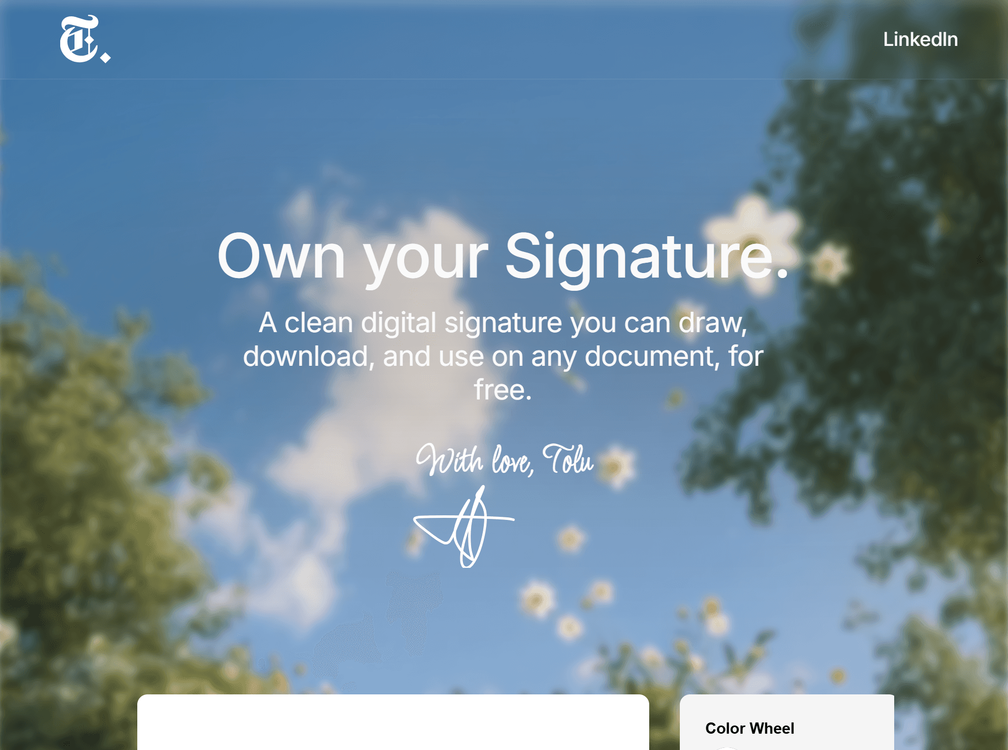
A signature is one of the oldest consent artifacts in human history. It carries legal weight, personal meaning, and social trust. Signmark is a lightweight tool for creating, styling, and exporting digital signatures, built around the idea that a signature should feel as intentional and trustworthy in digital contexts as it does on paper.
This project sits at the intersection of UX process, digital identity, and designing for trust.
Problem
Creating a digital signature should take less than a minute. In practice, most free tools make it feel like a chore.
The common experience goes like this: you find a free signature tool, it asks you to create an account before you can do anything. You sign up, navigate a cluttered interface, and then realise the tool does not actually let you download your signature. Instead, it asks you to upload a PDF first, sign inside it, and download the entire document. The signature itself is never yours to keep or reuse.
The tools that have a clean, well-designed interface sit behind a paywall. The ones that are genuinely free come with data collection, saved signatures you did not consent to storing, and flows that take far longer than they should.
There was no middle ground: a tool that is free to use, requires no account, collects no data, respects your time, and simply lets you draw your signature, download it, and use it wherever you need it.
Signmark is that middle ground. You open it, you sign, you download, and you leave. Nothing is stored. Nothing is collected. The signature is yours.
Questions I Explored
What role does a signature play as a consent artifact in digital financial flows?
How do we design a signature experience that feels trustworthy, not just functional?
What does a clean, exportable output mean for a user who needs their signature to hold up across documents, platforms, and verification flows?
How do we reduce friction without reducing the intentionality of the action?
How do we make this work for someone on a low-end mobile device who is not tech-savvy?
The colour pallette
Design Process
I approached Signmark with a clear framework: understand the context of use, identify where friction and distrust enter the experience, and remove both without removing the weight of the action.
Research and framing:
I started by looking at where signatures live in digital products, not just as aesthetic elements, but as functional trust signals. In lending and agreement flows, a signature is often the last step before money moves or a commitment takes effect. The design of that moment directly affects whether a user feels confident or anxious.
Defining the core interaction:
The primary question was what a user needs to feel when they create or apply their signature. The answer was ownership and control. They needed to feel that the signature was theirs, that it looked credible, and that they could use it confidently in formal contexts.
Iterating on the interface:
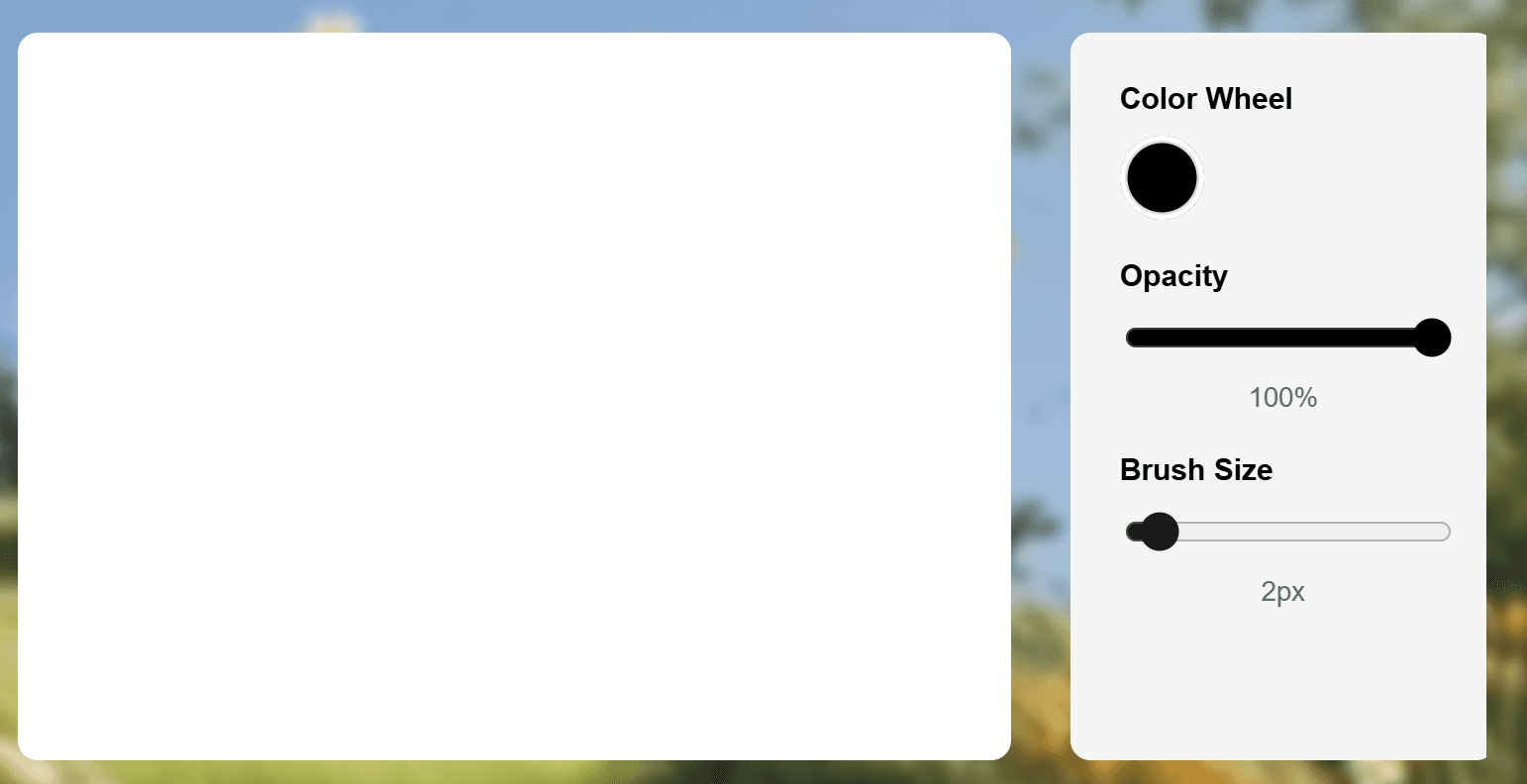
I kept the interface to a single screen to reduce cognitive load. Every control existed to give the user more ownership over their output, not to add complexity. I tested the flow by simulating document-signing contexts and asking whether a user would feel confident submitting this signature in a formal agreement.
SVG and PNG outputs were not just feature decisions. They were trust decisions. A clean, background-free export means the signature works in professional and formal environments without looking amateur or unofficial.
The Interface on a Desktop breakpoint
Key Design Decisions
Real-time preview:
Letting users see their signature evolve as they create it is a trust decision, not just a usability one. It gives users the chance to confirm that the output is genuinely theirs before they commit to it.
Clean export formats:
SVG and PNG without background clutter mean the signature works in any professional context including documents, e-contracts, and portfolios.
Single-screen interface:
Removing navigation meant removing anxiety. The user never has to wonder where they are in the flow or what comes next. This also made the tool immediately usable for people with no design background and for users on a mobile device.
Signmark Mobile break point
Built for Real-World use
Accessible on mobile:
Signmark was designed with mobile access as a priority, not a nice-to-have. A significant portion of users in financial and professional contexts sign or submit documents from their phones. The drawing canvas, controls, and export flow all scale and respond cleanly across screen sizes, so a user on a small screen has the same confident experience as someone on a large desktop monitor.
The interface requires no design skill or technical knowledge to use. Labels are plain, controls are minimal, and the path from open to download is three steps. This matters because the people who need clean, credible signatures the most, such as freelancers, small business owners, and individuals navigating financial agreements, are often the least served by complex tools.
SVG exports as professionally credible artifacts:
Choosing SVG as the primary export format was a deliberate decision rooted in how signatures need to function across different environments.
Unlike PNG, which is pixel-based and loses clarity when scaled or printed, SVG is vector-based. It is built from mathematical paths, which means it stays perfectly sharp at any size, on any device. Whether a signature ends up on a small phone screen or a large monitor, it remains clean and legible. That consistency matters when a signature represents you in
a professional context.
The goal was to make sure that every signature created in Signmark was not just visually clean, but technically sound enough to go anywhere.
The Home Page on the Tablet breakpoint
What I Learned
1. Designing Simple, Intuitive Experiences
I learned how to create a clean, minimal interface that prioritizes a single user goal, making signature creation seamless, fast, and enjoyable.
2. Overcoming Technical Challenges in Layouts
Integrating AI outputs into a functional website taught me how to unnest complex layouts and handle responsive design. It was challenging but gave me a deeper understanding of web layout mechanics and cross-breakpoint design.
3. AI Doesn’t Replace Effort
AI helped in certain parts of this project, but it didn’t magically solve everything. I still had to understand the problem, design the flow, and manually fix limitations.
4. Technical Limitations Shape the Final Design
Framer’s constraints forced me to rethink layouts, restructure components, and prioritize what was truly essential for the MVP.
Reflection
Simplicity is a trust signal. When a user completes an action quickly and walks away with
an output they feel confident using, the design has done its job. Designing a tool is different from designing a feature. Every decision compounds. An inconsistent button style or misaligned element is not just a visual issue, it is a credibility issue.
Signmark also showed me how much faster the build process can move when you use the right tools. AI handled the parts that did not need my judgment, which gave me more space to focus on the parts that did.